

Coordinated Family Outfits: A Guide to Color & Style
Table of Contents
- Why Coordinated Family Outfits Matter
- Color Palette for Family Portraits
- Family Photo Outfit Ideas That Work
- High-Visibility Swimwear for Kids in Family Coordination
- Styling for Holiday and Special Occasion Looks
- Mommy and Me Styles: Creating Visual Unity
- Budget-Friendly Coordination Tips
- Conclusion
Last Updated: August 27, 2026
Why Coordinated Family Outfits Matter
Family photos capture moments that last a lifetime. When everyone wears coordinated family outfits, those moments feel intentional, polished, and unified. The visual harmony created by thoughtful color choices and complementary styles tells a story of togetherness that resonates in every frame.
Beyond aesthetics, coordinated family outfits serve a practical purpose. They make it easier to spot your children in crowded spaces like beaches or public pools. When your kids wear bright, high-visibility swimwear in colors that coordinate with yours, you maintain better visual contact during family vacations or outings where multiple children need supervision (the CDC).
At Bright & Bold Swimwear, we've seen how coordinated outfits can simplify photo sessions and reduce stress. Parents spend less time debating what to wear and more time enjoying the moment.
Color Palette for Family Portraits
Choosing the right color palette is the foundation of successful coordinated family outfits. The colors you select determine whether everyone looks cohesive or chaotic in photos.
Understanding Color Theory in Family Photography
Color harmony in family portraits relies on three core principles: contrast, saturation, and undertone matching.
Contrast ensures your family stands out from the background. A family in soft pastels against a green forest backdrop will blur together; the same family in jewel tones will pop. Check your intended photo location's dominant colors first. If you're shooting in front of a brick building, avoid warm oranges and reds that echo the background. If you're at the beach, avoid blues and teals that merge with water and sky.
Saturation refers to color intensity. Highly saturated colors (bright, vivid hues) photograph boldly and work well for casual, energetic sessions. Desaturated colors (muted, dusty versions) photograph as sophisticated and work better for formal portraits. A family in muted sage, dusty rose, and warm taupe reads as intentional and elegant.
Undertone matching is where many families stumble. Every color has an undertone: warm (leaning yellow or orange), cool (leaning blue or purple), or neutral. When family members wear colors with clashing undertones, the coordination falls apart visually. Hold potential pieces next to each other in natural light to ensure they feel unified.
Neutral and Earth Tone Foundations
Neutral tones form the backbone of any coordinated family wardrobe because they work across skin tones and seasons. Whites, creams, taupes, and soft grays photograph beautifully and provide a calm, sophisticated backdrop that lets faces and personalities shine.
Earth tones, warm browns, terracotta, olive, sage, and warm grays, create visual warmth and harmony. They work well for families with different skin tones because earth tones sit naturally across the spectrum. The beauty of neutral foundations is their flexibility. You can keep two family members in neutrals while adding one accent color through a third person's outfit, creating visual interest without overwhelming the composition.
Seasonal Color Palettes and Natural Light
Seasonal color palettes align your coordinated family outfits with natural light quality and environmental backdrops.
Summer offers bright, directional light and blue skies. Saturated colors, coral, turquoise, sunny yellow, bright white, photograph beautifully. Fall brings warm, golden light and rich environmental colors. Deeper tones, burgundy, mustard, forest green, burnt orange, harmonize with autumn foliage. Winter offers cool, diffused light. Jewel tones like emerald and sapphire photograph richly, and classic reds and whites feel festive. Spring brings soft, even light. Soft pastels and lighter versions of seasonal colors feel fresh and align with the season's renewal energy.
Skin Tone and Color Matching
The most overlooked aspect of coordinated family outfits is matching colors to family members' skin undertones. A color that looks stunning on one family member can make another look sallow or washed out.
Families with warm undertones (golden, peachy, or olive skin) photograph best in warm colors: warm creams, terracotta, warm greens like olive or sage, and warm reds. Families with cool undertones (pink, rosy, or ashy skin) photograph best in cool colors: cool whites, cool grays, jewel tones like emerald and sapphire, and cool reds like burgundy. Neutral undertones have the most flexibility and can wear both warm and cool palettes.
When coordinating family outfits with mixed undertones, choose colors that sit in the middle: true neutrals, earth tones, or jewel tones that read as neutral. Avoid very warm or very cool extremes that will flatter one family member while making another look off.
Family Photo Outfit Ideas That Work
Planning coordinated family outfits requires balancing visual unity with individual expression.
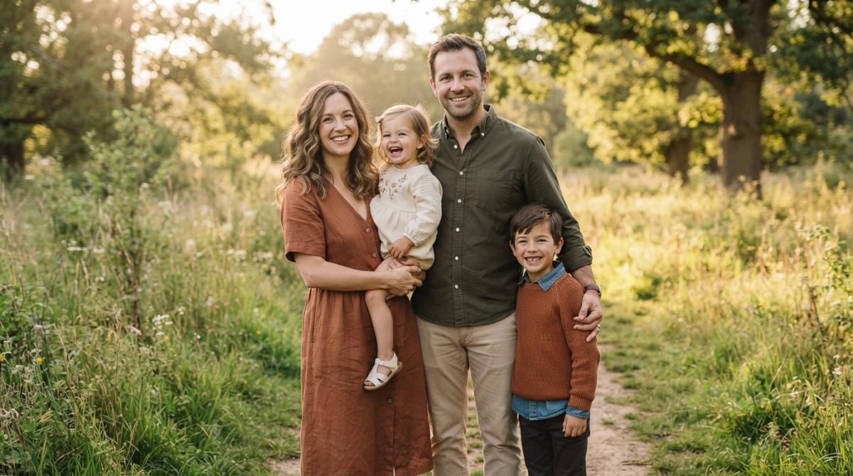
Matching vs. Complementary Styles
Many families default to matching outfits, everyone in the same shirt or dress. This creates instant unity but can feel costume-like, especially with older children who value individuality.
Complementary styles offer a sophisticated alternative. Everyone wears different pieces in the same color palette. A mother might wear a solid sage dress, the father a sage patterned shirt, and children sage shorts with white tops. The color palette unifies them; the variety keeps it natural. Matching works best when the garment is genuinely stylish on its own, not just as a costume.
Pattern Mixing Without the Clash
Patterns add personality to coordinated family outfits while maintaining cohesion. The key is mixing patterns that share a color story. If your palette is earth tones, pair a solid sage piece with a geometric pattern that includes sage and cream. Use the "two-thirds rule": if two family members wear solids and one wears a pattern, the composition balances.
High-Visibility Swimwear for Kids in Family Coordination
High-visibility swimwear for kids serves dual purposes in family coordination: it keeps children visible in water while offering bold colors that coordinate beautifully in photos.

Bright colors, hot pink, electric blue, lime green, vibrant orange, stand out against water and sand (the NIH). For family photo sessions, these bold hues create visual pop that photographs exceptionally well. When coordinating family outfits that include high-visibility swimwear, let the children's suits anchor the color story. If your kids wear bright pink and blue swimwear, choose complementary colors for your own outfit, perhaps neutral tones that let their visibility shine.
Bright & Bold Swimwear offers Boys swimsuits and Girls swimsuits in coordinating bold designs, along with Swim Accessories that extend your color coordination into the water.
Styling for Holiday and Special Occasion Looks
Holiday gatherings and special occasions call for elevated coordinated family outfits. For winter holidays, consider jewel tones or classic red-and-white combinations. A family dressed in coordinating emerald or sapphire pieces feels festive without costume-like matching. Gold or silver accents through jewelry or accessories add sparkle.
Holiday outfits benefit from texture layering. A knit sweater over a collared shirt, a velvet accent piece, or a patterned scarf adds depth. For summer celebrations or destination events, lighter fabrics and brighter palettes work best. Linen coordinates beautifully across coordinated family outfits because the fabric's natural texture adds visual dimension.
The most successful special occasion coordinated family outfits balance formality with comfort. If your children feel restricted or uncomfortable, that tension shows in photos.
Mommy and Me Styles: Creating Visual Unity
Mommy and me coordinated family outfits celebrate the parent-child relationship through intentional styling. Visual unity comes from matching silhouettes or color palettes rather than identical pieces. A mother and daughter might wear the same patterned dress in different sizes, creating obvious coordination.
The psychology of mommy and me coordination matters. Children feel seen and valued when their parent intentionally coordinates with them. This emotional connection often translates into more genuine smiles and relaxed poses in photos. Quality pieces designed for both adults and children make this easier. The Magical Family Clothing collection offers coordinating options for parents and children, making it simple to create outfits that feel natural rather than forced.
Mommy and me styling works best when the child has input. Asking your daughter which color she prefers or letting your son choose between two coordinating options gives him agency.
Budget-Friendly Coordination Tips
Creating coordinated family outfits doesn't require spending a fortune or buying matching sets. The most budget-friendly approach is strategic coordination using pieces you already own, paired with targeted, intentional new purchases.
Audit Your Existing Wardrobe for Hidden Coordination
Before buying anything new, conduct a wardrobe audit specifically for coordination potential. Pull out every neutral and earth-tone basic each family member owns: white shirts, cream sweaters, gray pants, denim in similar washes, khaki shorts, navy pieces, beige or taupe items. Lay them out by person and look for overlap. If everyone has white basics, white becomes your foundation color at zero cost.
Next, identify one accent color that appears across multiple family members' closets. Perhaps your daughter has a sage dress, you have a sage sweater, and your son has a sage shirt. Sage is now your coordinating accent color. The key is looking for color families, not exact matches. A light gray, medium gray, and charcoal gray all belong to the gray family.
The Three-Piece Coordination Formula
Once you've identified your foundation color and accent color, use the three-piece formula to build coordinated family outfits with minimal new purchases.
Piece 1: Foundation (what you have). Everyone wears a neutral basic in your identified foundation color. White shirt, cream sweater, gray pants, or denim.
Piece 2: Accent (what you have or buy one). Everyone wears or adds one piece in your accent color. If everyone already has something in sage, use it. If only one person does, you might buy one additional sage piece to extend the accent color across the family.
Piece 3: Individual expression (what you have). Each person adds one piece that reflects their style: a patterned scarf, a favorite jacket, a statement necklace, or a textured sweater. This piece should stay within your color palette, but it allows individuality.
This formula works because it creates visual unity through color while allowing each person to feel like themselves.
Strategic Shopping for Maximum Reuse
When you do buy new pieces, choose items that work across multiple seasons and occasions, not one-off coordinating sets. Invest in versatile basics in your identified colors. A well-made white t-shirt, a cream sweater, a taupe cardigan, or neutral pants work year-round and coordinate with almost everything.
Buy accent pieces at the end of season for next year. A sage sweater purchased in January for next fall costs significantly less. Choose pieces with longevity over trendy items. A well-constructed coordinated family outfit piece in a classic color offers better value than cheap options that fall apart after one season. Mix high and low strategically, invest in the items that anchor your coordinated outfits and get the most wear.
Free and Low-Cost Coordination Tricks
Some of the most effective coordination costs nothing. Matching accessories create coordination without matching clothes. Everyone wears the same color belt, the same style of shoes, or the same color hair accessory. A family in different neutral outfits but all wearing white sneakers reads as coordinated.
Layering creates coordination from pieces you have. A white shirt under a sage sweater, a cream cardigan over a patterned dress, layering lets you build coordinated outfits from pieces that don't match on their own. Rolled sleeves, tucked shirts, and cuffed pants change how pieces read together. Thrifting and hand-me-downs extend your color palette cheaply.
The Psychology of Intentional Coordination
The most budget-friendly coordinated family outfits are the ones that feel intentional, not forced. A family in white basics and sage accents with individual textured pieces looks like everyone has good taste and planned together. Intention costs nothing. It's the difference between "we all wore white and added sage because those colors work together" and "we all bought the same outfit."
Frequently Asked Questions
How do you coordinate family outfits without looking identical?
Coordinated family outfits don't require matching pieces. Instead, choose a shared color palette and vary the shades, patterns, and textures across family members. For example, one person wears a solid navy shirt while another wears navy stripes, and a third wears a complementary earth tone. This creates visual harmony and unity without appearing too matchy. Texture layering and accessory choices add depth while keeping the overall aesthetic cohesive.
What are the best color palettes for family photos?
Neutral tones like cream, gray, and tan create timeless family portraits. Earth tones including warm browns, sage green, and rust work beautifully together. Cool palettes with navy, soft blues, and whites offer a fresh look. The key is choosing 2-3 complementary colors and distributing them across family members so no single color dominates. Seasonal trends suggest jewel tones in fall, pastels in spring, and warm golds in summer.
How can high-visibility swimwear be incorporated into family coordination?
High-visibility swimwear for kids in bright neons and bold colors can anchor a coordinated family look at the pool or beach. Pair children's vibrant swimsuits with adults wearing complementary solid colors or subtle patterns in the same color family. This approach maintains visual unity while ensuring children remain easily spotted in the water. Bright and Bold Swimwear offers vibrant options that coordinate beautifully with neutral adult pieces, creating both safety and style.
What is the difference between matching and complementary family outfit coordination?
Matching outfits mean everyone wears identical or nearly identical pieces, which can feel too formal or staged. Complementary coordination uses a shared color palette where each family member wears different pieces in coordinating shades and styles. This approach feels more natural, allows for individual personality, and photographs beautifully because it creates visual balance rather than uniformity. Most modern family styling favors the complementary approach for a relaxed, intentional look.
This article was written using GrandRanker